How to Improve Wix Conversions Fast

A Wix site can look polished and still fail at the one job that matters most - turning visitors into inquiries, bookings, or sales. If you're wondering how to improve Wix conversions, the issue is usually not Wix itself. It is the strategy behind the page: what you say, how quickly people understand it, and how easily they can take the next step.

For small businesses, consultants, nonprofits, and service brands, conversion problems tend to be surprisingly consistent. The site says too much without saying the right thing. The call to action is vague. The mobile experience feels cramped. Trust is implied instead of proven. Fix those areas, and conversion rates can change quickly without rebuilding everything from scratch.
How to improve Wix conversions starts with clarity
Most website owners assume low conversions are a traffic problem. Sometimes that is true, but often the real issue is message clarity. If a visitor lands on your homepage and cannot answer three basic questions within a few seconds, you will lose them. What do you do? Who is it for? Why should they trust you?
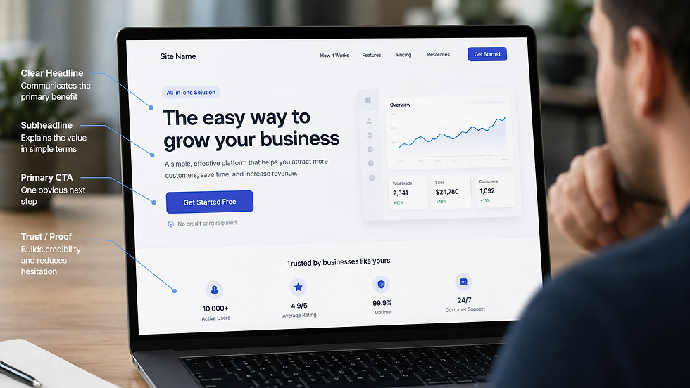
Your homepage should not read like a general business description. It should act like a filter and a guide. Strong Wix websites lead with a clear headline, a supporting subheadline, and one primary action. That action might be to schedule a consultation, request a quote, apply for services, or make a donation. What matters is that the next step is obvious.
This is where many service businesses get stuck. They try to sound professional by being broad. The result is copy that feels safe but forgettable. Conversion-focused messaging is narrower. It names the audience, speaks to the pain point, and shows the result. Instead of saying, "We help businesses grow," say what kind of business, what problem you solve, and what improvement they can expect.
Build each page around one conversion goal
A common reason Wix sites underperform is that every page tries to do too many things at once. A homepage asks people to read the blog, follow on social media, browse services, subscribe to updates, and fill out a contact form. When every path is presented equally, visitors delay the decision or leave.
Each core page should support one main conversion goal. Your homepage might drive visitors to book a consultation. Your service pages might drive quote requests. Your nonprofit campaign page might focus on donations or volunteer signups. Secondary actions can still exist, but they should not compete visually with the primary one.
This applies to button language too. "Learn More" is often too weak to move someone forward unless it leads to a critical next step. More direct language usually performs better because it reduces uncertainty. "Book a Consultation," "Request Pricing," or "Start Your Project" tells visitors what happens next.
The trade-off is that stronger calls to action can feel more direct, and some brands worry that sounds pushy. In practice, clarity usually feels more helpful than pressure. People convert when they understand the process.
Improve Wix conversions by reducing friction
Good conversion design is not about adding more elements. It is often about removing hesitation.
Start with navigation. If your menu has too many options, users spend energy sorting instead of acting. Keep it simple and group pages in a way that reflects how people actually make decisions. For most service businesses, that means prioritizing Home, Services, About, Results or Portfolio, and Contact.
Then look at forms. Long forms reduce inquiries unless there is a strong reason to ask for extra details. If your goal is lead generation, ask only for the information needed to start the conversation. Name, email, phone, and one short message field is often enough. You can collect more detail later.
Page speed also matters, especially on mobile. Wix gives businesses a lot of visual flexibility, but large images, heavy animations, and cluttered sections can slow down the experience. A slower site creates doubt before a visitor even reads your offer. If speed and design are in conflict, conversion should win.
Trust signals are not optional
Visitors rarely convert because a site is merely attractive. They convert because they feel confident.
That confidence comes from proof. Testimonials, reviews, client logos, certifications, case study results, before-and-after examples, and clear process explanations all reduce perceived risk. If you serve local clients, showing your location or service area can also increase trust. If you are a consultant or service provider, a strong photo and founder introduction can make the business feel more credible and accountable.
The key is placement. Trust signals should appear near moments of decision, not hidden on a separate page no one visits. If your contact section asks people to book a call, place a testimonial nearby. If your service page explains a premium offer, include proof that it works. This is one of the most practical ways to improve Wix conversions because it aligns reassurance with action.
There is a nuance here. Too much proof can create clutter, especially if everything is presented at once. Choose the trust elements that match the buyer's concerns. A nonprofit donor may care about transparency and impact. A business owner hiring a web partner may care more about expertise, process, and results.
Mobile experience usually decides the outcome
Many Wix websites are designed on desktop first and only checked on mobile later. That sequence creates problems because a large percentage of visitors will see the mobile version first.

On mobile, attention is shorter and friction is more obvious. Headlines that feel balanced on desktop become too long. Buttons get buried. Text blocks turn dense. Sections stack awkwardly. If someone has to scroll through filler before finding the action button, conversion drops.
To improve mobile conversions, tighten your copy, shorten sections, and make sure your top call to action appears early. Use spacing carefully so the layout breathes, but do not force users through endless scrolling. Also test tap targets, sticky headers, mobile menus, and forms yourself. A site can be technically mobile-friendly and still feel frustrating to use.
For local service businesses, mobile intent is often high. Someone checking your site from a phone may be ready to call or submit an inquiry now. Make that easy.
Service pages should sell the outcome, not just describe the service
Many business owners treat service pages like placeholders. They list features, add a few paragraphs, and move on. But service pages are often where conversions happen, especially for visitors coming from search.
A strong service page starts by describing the problem the visitor wants solved. Then it explains the result, your approach, and what working with you looks like. This structure works because it mirrors the buyer's internal questions. Can you help me? How will this work? What can I expect next?
It also helps to address objections directly. If prospects worry about budget, timeline, complexity, or whether Wix is the right platform, answer those concerns in the copy. You do not need to overexplain. You just need to remove uncertainty.
For businesses serious about how to improve Wix conversions, this is one of the highest-impact areas to refine. Better service pages often increase both form submissions and lead quality because they pre-qualify visitors before they reach out.
Use your Wix tools strategically, not all at once
Wix includes useful features for lead capture, scheduling, pop-ups, chat, forms, and automations. The mistake is assuming more tools automatically mean more conversions.
A pop-up can help if it offers timely value and appears after genuine engagement. It can also hurt if it interrupts too early. Live chat can improve conversions for high-intent visitors, but only if someone is actually available or if the automated responses are helpful. Online booking can shorten the path to action, but only when the service is simple enough for a visitor to book without needing a sales conversation first.
The right setup depends on your business model. A consultant may benefit from a clean appointment flow. A nonprofit may need stronger donation prompts and storytelling. A growing service brand may see better results from a short inquiry form paired with a clear process section. Strategy matters more than features.
Measure what people do, not what you assume
Website owners often redesign based on opinion instead of evidence. If you want better conversions, start watching behavior.
Look at which pages attract traffic, where users drop off, how far they scroll, which buttons get clicked, and which traffic sources bring qualified leads. If a page gets visits but no inquiries, something on the page is misaligned. If users reach the form but do not submit, the issue may be friction or lack of trust. If traffic is low-quality, conversion problems may begin before visitors ever land on the site.
Even small testing cycles can reveal a lot. Rewrite the hero section. Change the primary button text. Shorten the form. Reorder sections on mobile. Add proof near the call to action. You do not need a full overhaul to see measurable gains.
That is often the turning point. Businesses stop asking whether Wix can convert and start building a Wix site that is designed to convert. With the right structure, messaging, and follow-through, your website stops acting like an online brochure and starts doing its actual job - earning trust and generating real opportunities.
If your website already gets attention, you may be closer than you think. Better conversions usually come from sharper decisions, not more noise.